20 Best Paint Colours For 2023 According To Interior Designers (Part 1)
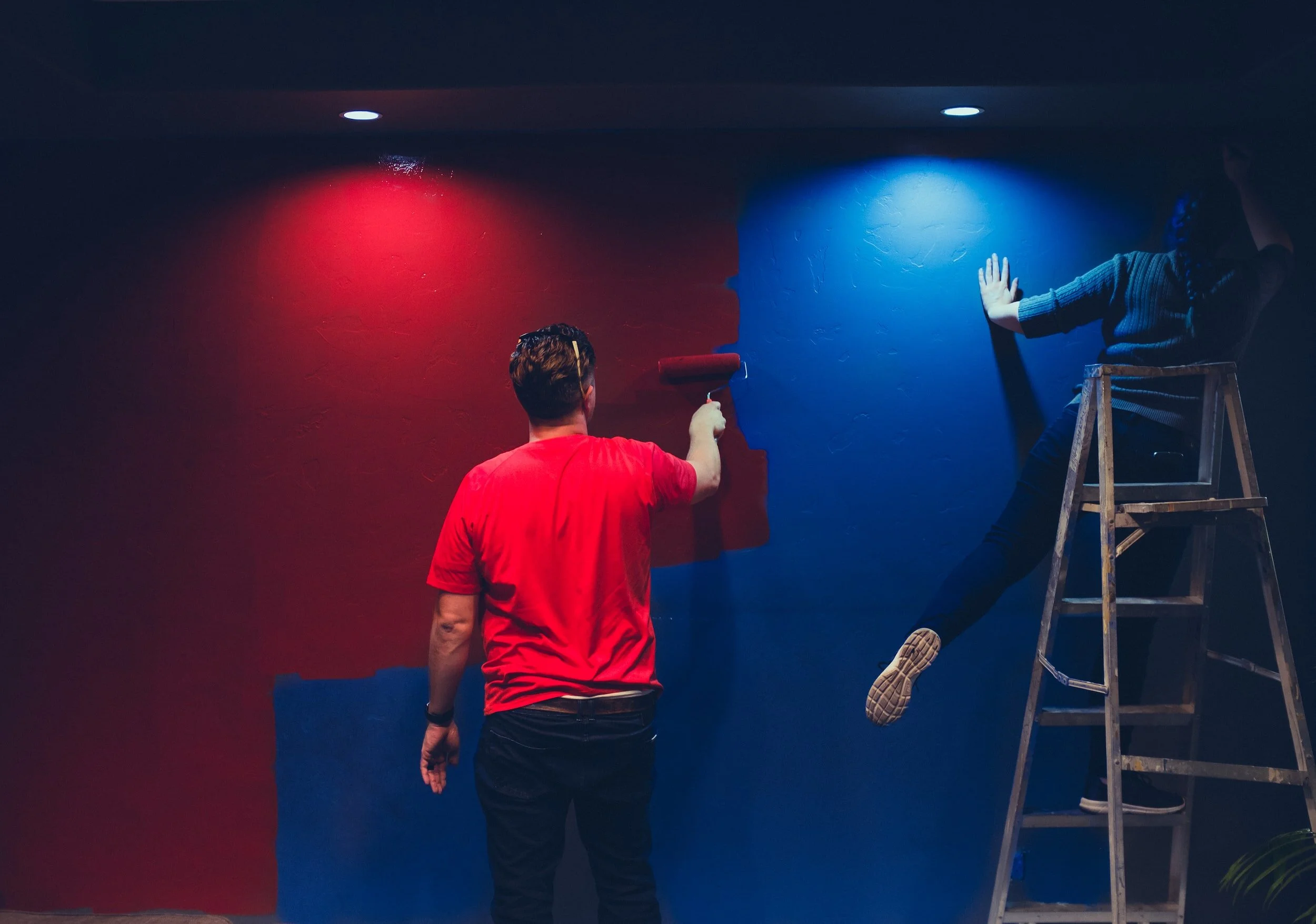
You may have heard the word ‘HUE’ in relation to paint, but have no idea what it actually means?
Hue means: A particular gradation of colour; a shade or tint.
What you may not KNOW is that it is the UNDERTONE (the blend of hues) contained within the paint, that will have the overall effect of the paint on your actual walls (as well as: natural light, location and orientation) Most people look at the colour swatch or sticker on the paint tin and think this will be the final finish and find themselves very disappointed with the final result - this is why!
There are endless articles depicting the ‘colours of the year’ but let us guarantee you how one colour looks on one wall will be completely different as to how it will look on another wall in another space!
Take a look at the video below which perfectly demonstrates how the natural light changes within the interior space throughout the day:
This video demonstrates perfectly how the natural light against the walls changes throughout the day, when the room is exposed to different strains of light from the morning into the early evening.
If you really want to understand how lighting, location and orientation play an important role within your interior it is worth your investment of time embarking on one of our Learn Me interior design courses which empower you with the professional skills and expertise of an interior designer to complete your design projects. This is why interior designers advocate ‘Tester Pots’ and ‘Samplize’ (the very exceptional and handy large peel and stick paint swatches, to test out colour on your walls before making an expensive paint investment mistake!)
SO BEFORE WE EMBARK ON THE BEST PAINT COLOURS LET’S BE HONEST WITH THE REALITY OF COLOUR TRENDS: THEY MAY NOT WORK FOR YOU WITH THE NATURAL LIGHT YOU HAVE WITHIN YOUR INTERIOR SPACE!
20. Citrus | SPEAK pick: Citron (2024-30) - Benjamin Moore
Fresh, exciting and invigorating. There is nothing better than a mellow yellow within an interior space. The energy and happy mood mode this colour evokes is only ever positive within interior spaces. It is extremely hard to think of citrus without a smile on your face!
19. Blush | SPEAK pick: Redend Point - Sherwin Williams
A tribute to pink and raspberry: this tone allows for many accent colour combinations which is why it is a truly versatile and modern chic shade.
18. Light Blue | SPEAK pick: Palladian Blue (HC-144) - Benjamin Moore
A soft gentle sky like blue with a white mother of pearl undertone: stunning!
Palladian Blue (HC144) - Benjamin Moore | Image Credit: Benjamin Moore
17. Gray | SPEAK pick: Gentlemen’s Gray - Benjamin Moore
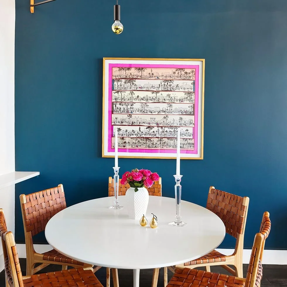
A blackened blue and teal combination, such a striking and beautiful hued toned. Bravo Benjamin Moore!
16. Plum | SPEAK pick: Velvet Plum (CSP-420) - Benjamin Moore
A deep dark rich smoky dramatic purple.
15. Ultramarine Blue | SPEAK pick: Ultramarine Blue -Mylands
This shade is simply exceptional: Wow! Bold, bright, vivid and packed full of energy and life!
14. Light Gray | SPEAK pick: Mt. Rainier Gray (2129-60) -Benjamin Moore
Icy blue combined with a sleek gray -taking a soothing gray to a whole new combination level. This is a SPEAK personal favourite!
13. White | SPEAK pick: Blank Canvas - Behr
A neutral off-white, clean and inviting a blank slate just like it’s name allowing for endless accent colour combinations, well done Behr!
Blank Canvas - Behr | Image Credit: Behr
12. Green | SPEAK pick: Boreal Forest (AF-480) -Benjamin Moore
A spectacular deep and rich forest green, evoking warmth and texture within a space.
11. Aubergine | SPEAK pick: Brinjal (No 222) - Farrow and Ball
Brinjal takes its name from the beautifully deep and shiny skin of the aubergine. It can create a warm and highly sophisticated finish when used on all walls.
10. Lime | SPEAK pick: Pretty Ugly - Backdrop
A very vivid, bold lime green. As the name states: ‘it’s pretty, it’s ugly, the shade you have been looking for’
We will be back shortly with the remaining top ten paint colours for 2023.
We hope we have inspired you with paint colours which break the mould and provide interesting tones, textures, boldness and richness to interiors.
Remember it is all in the hue (we cry- there is a band name there somewhere!)
View Part 2 here: Part 2 20 Best Paint Colours
We believe interior spaces should be experiential tapestries inspired by nature which serve, connect, enrich and delight the senses. Our designs must inspire, speak, touch and impact the hearts, minds and imagination of all those that engage with them.
SPEAK Interior Design


